CanvasXpress Data Management
This section explores data management in CanvasXpress for Python in detail. Specifically, there are two perspectives that need to be understood:
- CanvasXpress for Javascript JSON data objects
- Python data objects and their transformation into JSON data objects
JSON Data Objects
To work with CanvasXpress, it is imperative to have a general understanding of how data is structured so that it can be properly illustrated.
It is strongly recommended that you read CanvasXpress for Javascript JSON data objects.
In summary, CanvasXpress can work with various data formats. These can be simple, such as a CSV, or more complicated, such as for correlations or venn charts.
Regardless, CanvasXpress wants to know about three topics when consuming the data for plotting:
- The data itself, which is tracked in a
yattribute - Annotations for samples (columns), tracked in a
xattribute - Annotations for variables (rows), tracked in a
zattribute
y is mandatory, but x and z are optional.
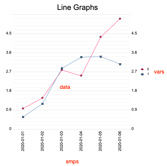
Consider the following matrix:
   2020-01-01  2020-01-02  2020-01-03  2020-01-04  2020-01-05  2020-01-06
0    0.814815    1.875444    2.340841    2.279296    4.375831     3.54344
1    0.853220    1.736362    2.611956    3.597166    4.146341     4.63242
This is expressed at a minimum to CanvasXpress as a JSON data object:
{
    "y": {
        "vars": [
            0,
            1
        ],
        "smps": [
            "2020-01-01",
            "2020-01-02",
            "2020-01-03",
            "2020-01-04",
            "2020-01-05",
            "2020-01-06"
        ],
        "data": [
            [
                0.9669040908711064,
                1.4666314831549938,
                2.7875097369585076,
                2.516903607418437,
                4.341416062897548,
                5.198483033228731
            ],
            [
                0.5708513177432284,
                1.1909844314943148,
                2.863968555094556,
                3.3922728372428548,
                3.4122582648495534,
                3.057544399275495
            ]
        ]
    }
}
The y attribute tells CanvasXpress that the enclosed information pertains to
the data itself.
The matrix header is used to describe samples, designated as the smps attribute.
Each column is a sample index that will form the X or Y axis markers per the
chart orientation.
The row index, in this case not specifically assigned but ordinally implied as
0..N from top to bottom, indicates variables designated as the vars attribute.
Each row of data (a variable) is plotted aligned with the proper column of data (the sample) and marked accordingly.
The following code will generate a matrix, print the matrix, print the JSON data object, and then plot the chart:
from pandas import DataFrame
import json

from datetime import date, timedelta
from random import uniform

from canvasxpress.canvas import CanvasXpress
from canvasxpress.config.collection import CXConfigs
from canvasxpress.data.matrix import CXDataframeData
from canvasxpress.render.jupyter import CXNoteBook

# Generate a set of values over a 6-day period
start_date = date(2020, 1, 1)
header = [
    str(start_date + timedelta(days=i))
    for i in range(6)
]
content = [
    [
        uniform((i + 1) / 2, i + 1)
        for i in range(6)
    ],
    [
        uniform((i + 1) / 2, i + 1)
        for i in range(6)
    ]
]

# Establish the working matrix
values_by_day = DataFrame(
    content,
    columns=header
)
sample = CXDataframeData(values_by_day)

# Print the matrix
print("DataFrame:")
print(values_by_day)

# Print the corresponding JSON data object
print()
print("CX Data Perspective")
print(json.dumps(sample.render_to_dict(), indent=4))

# Configure a set of spark lines
chart_options = CXConfigs()
chart_options \
    .set_param("graphOrientation", "vertical") \
    .set_param("graphType", "Line") \
    .set_param("title", "Line Graphs")

# Create the chart
chart = CanvasXpress(
    render_to="sample_chart",
    data=sample,
    config=chart_options
)

# Render into Jupyter
nb = CXNoteBook(chart)
nb.render()
The above code illustrates a line chart, such as:
URL Data
In addition to specifying a JSON data object, CanvasXpress will also accept a URL referencing a file or endpoint with such information.
Python Data
CanvasXpress for Python provides two perspectives into data at the Python tier:
- The data itself, which can be matrix or key-pair in nature
- A data profile, which understands JSON data object requirements can provides the metadata necessary to make the data useable by CanvasXpress Javascript
CXData
All data is wrapped in the CXData structure, which is the root of a component
framework that understands the nature of various data sources and formats.
These components are responsible for converting the tracked data into a form
suitable for the y -> data portion of the JSON object.
Members of this framework include:
- CXData
- CXUrlData
- CXProfiledData
- CXMatrixData
- CXDataframeData
- CXCSVData
- CXKeyPairData
- CXDictData
- CXJSONData
- CXMatrixData
CXUrlData
CXUrlData Accepts a URL (which must begin with a scheme, such as file://,
https://, etc.). Basic validation is performed to ensure the validity of
the URL format at the Python tier, but otherwise the URL is passed as-is to
the CanvasXpress Javascript object.
from canvasxpress.canvas import CanvasXpress
from canvasxpress.config.collection import CXConfigs
from canvasxpress.data.url import CXUrlData
from canvasxpress.render.jupyter import CXNoteBook

# Configure a set of spark lines
chart_options = CXConfigs()
chart_options \
    .set_param("title", "Tooth Growth") \
    .set_param("smpLabelRotate", 90) \
    .set_param("graphType", "Boxplot") \
    .set_param("graphOrientation", "vertical") \
    .set_param("metaData", {"dose": True}) \
    .set_param("groupingFactors", [ "dose" ])

# Create the chart
chart = CanvasXpress(
    render_to="sample_chart",
    data=CXUrlData("https://raw.githubusercontent.com/neuhausi/Rdatasets/master/csv/datasets/ToothGrowth.csv"),
    config=chart_options
)

# Render into Jupyter
nb = CXNoteBook(chart)
nb.render()
CXDataProfile
The simplest means of getting started with CanvasXpress for Python in terms of
data preparation and application is to use one of the CXKeyPairData components
and format the context exactly as how the Javascript library prefers.
In fact, if working with example data from the
CanvasXpress site this is the faster way to
begin using the framework.
However, data consumed or generated by Python modules or scripts is very likely
to be unaware of CanvasXpress JSON data object requirements. In this case, a
CXDataProfile can be used to ensure that the y attribute is properly
formatted and populated.
Members of the profile framework include:
- CXProfileException
- CXDataProfile
- CXStandardProfile
- CXCorrelationProfile (TBD)
- CXVennProfile (TBD)
All CXProfiledData objects are provided with CXStandardProfile, which
understands the typical JSON data object requirements.
For matrix data, CXStandardProfile will inspect the matrix and determine
appropriate vars and smps values.
For key-pair data, CXStandardProfile will first check to see if attributes
such as y, vars, smps, and data exist. As they do, they are adopted
from the data as-is. As they do not, the profile inspects the object for
elements that can be used directly or for a calculation to create proxies.
It is also possible to override the vars and smps values in the data
objects by assigning new values to vars and smps properties for the
profile. For example, in the initial example on this page the sample object
provides default vars values of [0, 1] because that's the implied row
index. Instead, those values could be replaced:
sample.profile.vars = ['A', 'B']
In which case, the legend in the screenshot would update to using the letters
instead of the numbers. Here is the code revisted with vars and smps
overriden so that the effect can be compared:
from pandas import DataFrame
import json

from datetime import date, timedelta
from random import uniform

from canvasxpress.canvas import CanvasXpress
from canvasxpress.config.collection import CXConfigs
from canvasxpress.data.matrix import CXDataframeData
from canvasxpress.render.jupyter import CXNoteBook

# Generate a set of values over a 6-day period
start_date = date(2020, 1, 1)
header = [
    str(start_date + timedelta(days=i))
    for i in range(6)
]
content = [
    [
        uniform((i + 1) / 2, i + 1)
        for i in range(6)
    ],
    [
        uniform((i + 1) / 2, i + 1)
        for i in range(6)
    ]
]

# Establish the working matrix
values_by_day = DataFrame(
    content,
    columns=header
)
sample = CXDataframeData(values_by_day)

# Print the matrix
print("DataFrame:")
print(values_by_day)

# Print the corresponding JSON data object
print()
print("CX Data Perspective")
print(json.dumps(sample.render_to_dict(), indent=4))

# Configure a set of spark lines
chart_options = CXConfigs()
chart_options \
    .set_param("graphOrientation", "vertical") \
    .set_param("graphType", "Line") \
    .set_param("title", "Line Graphs")

# Create the chart
chart = CanvasXpress(
    render_to="sample_chart",
    data=sample,
    config=chart_options
)

# Render into Jupyter
nb = CXNoteBook(chart)
nb.render()

# Change the variables
print()
sample.profile.vars = ["Gas Trucks", "Electric Trucks"]
print(json.dumps(sample.render_to_dict(), indent=4))
nb.render()

# Reset the vars to the default calculated from the matrix
sample.profile.vars = None

# Change the samples
print()
sample.profile.smps = ['A', 'B', 'C', 'D', 'E', 'F']
print(json.dumps(sample.render_to_dict(), indent=4))
nb.render()
The Data Must Still be Reasonable...
Although data and profile components do their best to create appropriate
transformations to satisfy CanvasXpress at the Javascript tier, it is up
to the Python logic to ensure that reasonable data is provided to begin with.
A key-pair object that is not already arranged to satisfy CanvasXpress y[data]
expectations will not be usable by the chart, just as would be the case if
working in Javascript directly.
Roadmap
For now, developers requiring access to full CanvasXpress JSOn data functionality
should use CXKeyPairData components and directly format the content as desired.
The current package provides y perspective translation as is typically needed
for charts other than Venn diagrams, whether the data is matrix or key-pair.
We are now actively working to add or enhance support for:
- Profiles addressing the custom data attributes for correlation and venn
- Attribute handling for
xandztopics
The above functionality is expected to roll out as part of May and June releases.
